How Our Most Recent Software Updates Increase Your Productivity
Take a look at the latest changes made across the Suite!
In the ever-changing world of project management, staying ahead of the curve is critical to ensuring smooth workflows and efficient collaboration. We are thrilled to share the most recent Zenkit Suite updates with you today! These updates are meant to improve the way you plan and track your projects, as well as provide a slew of visual updates that will allow teams to achieve unprecedented productivity and success.
Visible Project View Tabs and Improved Filtering
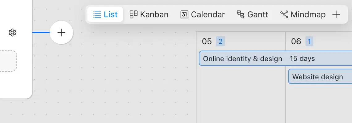
The revamped header design, which promises to improve the user experience and streamline project management workflows, is one of the most significant updates in the latest software release. Users can now easily access all available project views with a single click thanks to the new header design. This user-friendly feature enables project managers and team members to quickly shift their focus from one project view to another, allowing them to gain comprehensive insights into their projects with minimal effort.
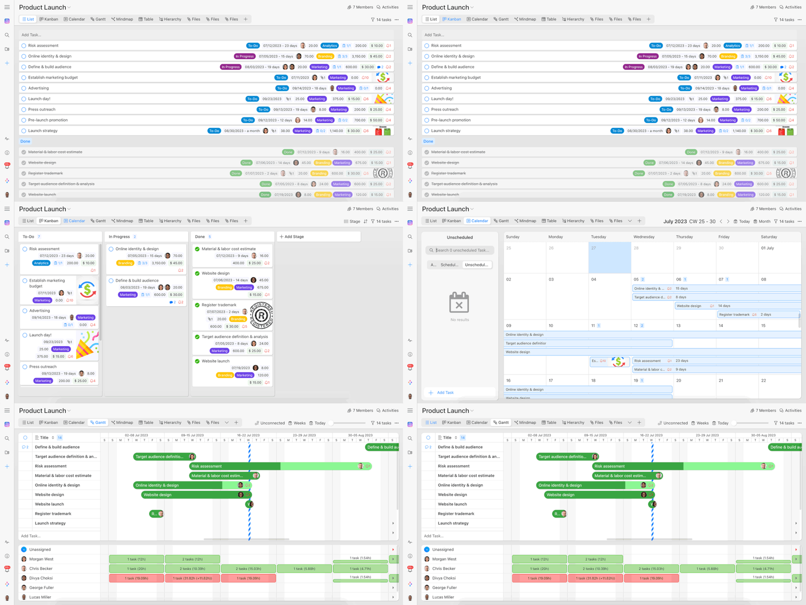
Additionally, the filter dialog has been significantly improved, now allowing users to save filters for the current view. This feature opens a world of possibilities in terms of customization and adaptability. Project managers can now create multiple views of the same type, each with its own set of filter options. This means that different teams or stakeholders can have tailored views that meet their specific needs and requirements. Whether filtering tasks based on priority, due dates, or assigned team members, the new filter dialog allows for a highly personalized project management experience, optimizing productivity and ensuring that everyone has access to the most relevant project information.
These enhancements not only provide a more intuitive and user-friendly interface but also enable project managers and teams to have a broader view of their projects while still having the freedom to customize their workspace. The new header design revolutionizes project management by reducing navigation complexity and enabling customized filters, ultimately fostering better collaboration, faster decision-making, and improved overall project performance.
Improved Calendar View
The most recent software update also includes an exciting redesign of the calendar feature, providing users with a new and intuitive experience when managing their schedules. The revamped “Week view,” now equipped with an hour grid to simplify event scheduling, is at the forefront of this update. The days of guesswork are over, as users can easily resize and reschedule events by dragging the edges of the events. This simple functionality gives users precise control over their time management, allowing them to make changes to their schedules with a few clicks.
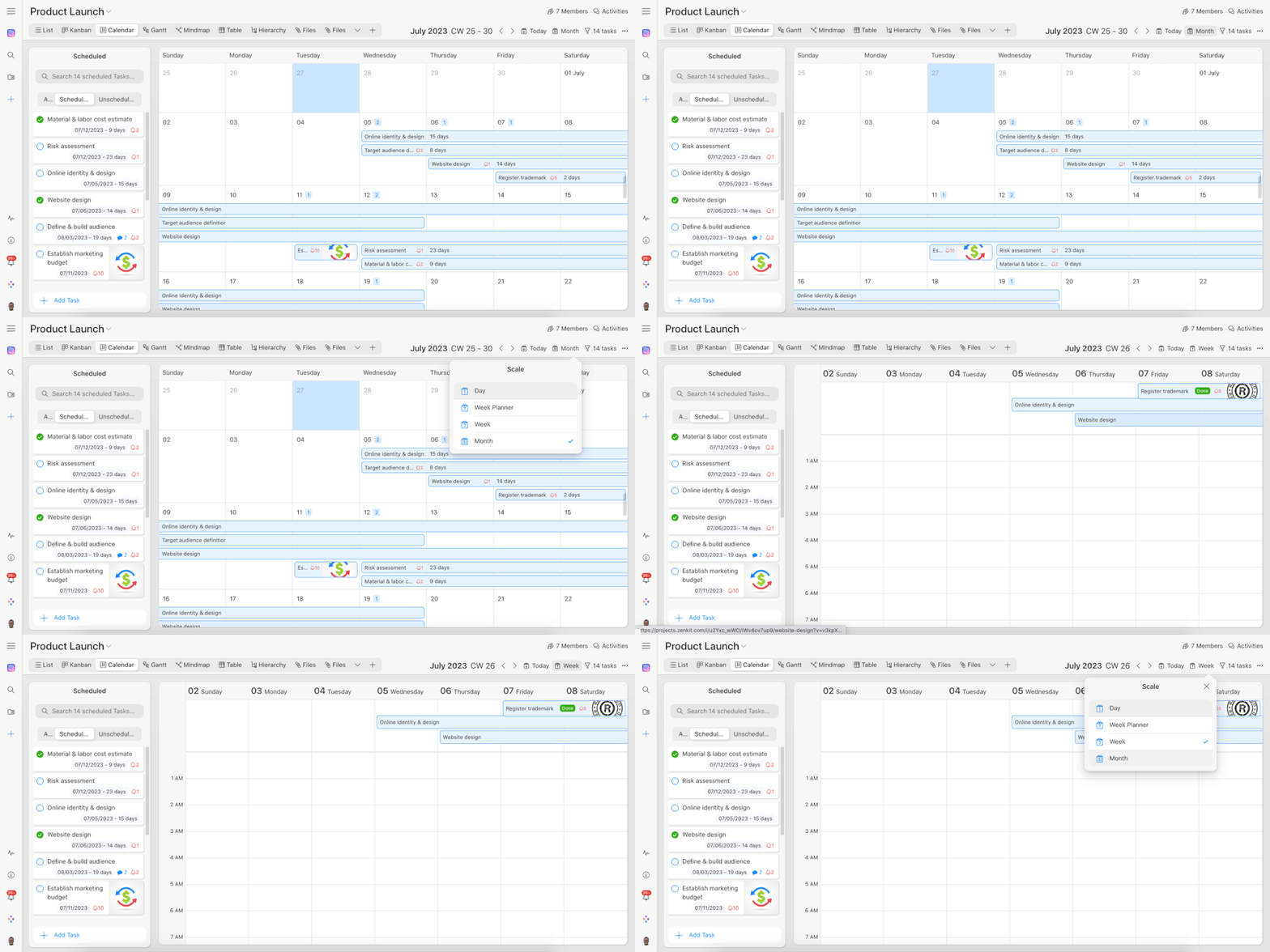
Recognizing the need for greater granularity in organizing workdays, the update also introduces a brand new “day view.” This addition enables users to break down their work week into individual days, providing a focused perspective on daily tasks and commitments. The day view ensures that users can plan and optimize their days with maximum efficiency, whether it’s allocating time for important meetings, blocking off dedicated work periods, or managing personal appointments.
In addition to functional enhancements, the software update improves the overall design of the Calendar view. The new design emphasizes visual contrast, making it easier to differentiate between different events and schedules. Users can quickly navigate through their calendars, effortlessly absorbing information and making informed decisions about their upcoming engagements, thanks to a clean and modern interface. The visually appealing update improves the overall user experience, making scheduling a visually appealing and efficient process.
Improved Visuals to Editing Forms
We’ve also updated Zenforms, our no-code form builder, in response to user feedback. This most recent update introduces a visually enhanced design for the form editor, with the goal of improving the visual interface and providing a more intuitive user experience. With these enhancements, users will be able to distinguish more easily than ever between the various stages of form creation: editing, previewing, and completing.
The form editor’s new design has been meticulously crafted to streamline the form-building process. The visual interface has been optimized to provide a clear distinction between the editing mode, in which users can easily customize form fields, layouts, and styles, and the preview mode, in which they can see how the form will appear to respondents. Furthermore, the new design includes a distinct “completion” view, which allows users to review and submit completed forms.
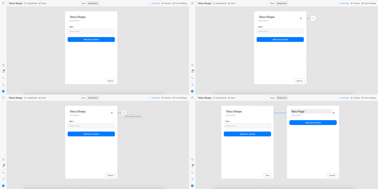
One of the most significant advantages of this update is its ability to increase productivity and decrease confusion when working with complex forms. The visually improved interface allows for a smooth transition between the editing, previewing, and completing stages, removing any guesswork and ensuring a more enjoyable form-building experience. Users will be able to more easily visualize the form’s appearance and functionality, allowing them to make precise adjustments and achieve the desired result.
Whether you’re an experienced form builder or new to the world of no-code development, this update will help you create professional and engaging forms with ease. The form editor’s improved visual interface sets the stage for efficient form creation, allowing you to focus on content and design while minimizing the time and effort required for form development.
Final Thoughts
That brings us to the end of the latest Suite update. We still have some amazing and intuitive features and updates in the works for you, but for the time being, we hope this latest instalment can help improve your workflow!
Free 30 min. consultation with Project Management Expert
Wanna see how to simplify your workflow with Zenkit in less than a day?
Book a Live Demo