


![]()
This blog post was written by a Zenkit partner. If you have an app that you think would make a great integration with Zenkit, get in touch with our partnerships team.
Why Dashboards?
A dashboard is a business intelligence tool (BI) that allows you to connect, aggregate, and visualize your data. One of the most valuable properties of a dashboard is its ability to build indicators based on how you want to aggregate your data. You can dig deep into your data and turn it into actionable insights, whether it’s for your project team or for your stakeholders.
The best dashboards use data visualization indicators that keep users engaged, informs them quickly, and provide the metrics they’re seeking.
Pictures Tell the Story Best
Data visualization graphics and indicators offer ways to present data in picture, graphic, or infographic form. Transforming raw data into easy-to-understand graphical representations helps you see patterns in your data you wouldn’t otherwise see. They help you connect the dots from one metric to the next so you can make more-informed, more accurate, and more effective business decisions.
Of course, data visualization isn’t a new concept. It has been around since someone sketched the first pie chart in the 1800s. If you consider the maps that have helped us navigate the world, data visualization has been around for a very long time.
But with the invention of the computer and the development of its profound ability to crunch large volumes of data, data visualization has become absolutely essential to make complex data easier to grasp, its trends more accessible, and its insights more valuable. From pie charts and bar charts to gauges, graphs, and pivot tables, visuals can deliver the bottom line of the data instantaneously.
Best Practices to Get Started with Dashboards
Here are the principles behind building the most effective dashboards:
1. Know your audience
There’s simply no point in spending time creating a dashboard if no one uses it. It’s critical to the success of your dashboard project to start with a conversation with your audience to set clear goals and define requirements:
- What questions do you want to answer?
- Who is going to use the dashboard?
- How much experience do your users have with the presented KPIs?
- What result do you want to achieve with this project?
- Make better decisions?
- Increase awareness?
- Responding to opportunities that are otherwise missed?
2. Don’t overdo the KPIs
The human brain is a wonder, but it has its limits, especially when it comes to processing data. We can only process four information chunks at the same time, according to the data visualization expert, Stephen Few. For that reason, too many indicators on the same dashboard will sabotage the very purpose of the dashboard—to get a clear understanding of project status, for example, or to monitor productivity. Bottom line: Limit the number of indicators to 10 or fewer per dashboard to maximize your results.
3. Explain the indicators
It is sometimes very valuable to add text to your dashboards—beyond the legends below the charts—to make things crystal clear for your users. Text can improve everyone’s understanding of your dashboard, for example:
- A glossary of indicators on the dashboard
- A formula or description of how they’re calculated
- Contextual help for certain graphics, for instance, describing where the data comes from, the period of time they’re looking at, or the filters that have been applied to the data can help users understand exactly what they’re looking at.
- Data refresh date. Help your users quickly see if they need to refresh the data in order to make reliable decisions based on it.
Project Management and Productivity Tracking
Let’s say you want to track your project status and team productivity in a single dashboard, you’d need to import data from a project management tool such as Zenkit and data from your time tracking tool to your BI tool.
Boost your teams productivity.
Try our all-in-one project management software for free now!
The dashboard categorizes your data by the department to identify overload or underutilization of resources. You can compare goals against achievements to identify if your projects and workers are on course to meet their targets and how efficiently they’re getting there.
Project Resources and Costs Tracking
Now, let’s say you want to monitor your project status and costs. Here’s an example of a dashboard that lets project managers track monetary and resource budgets.
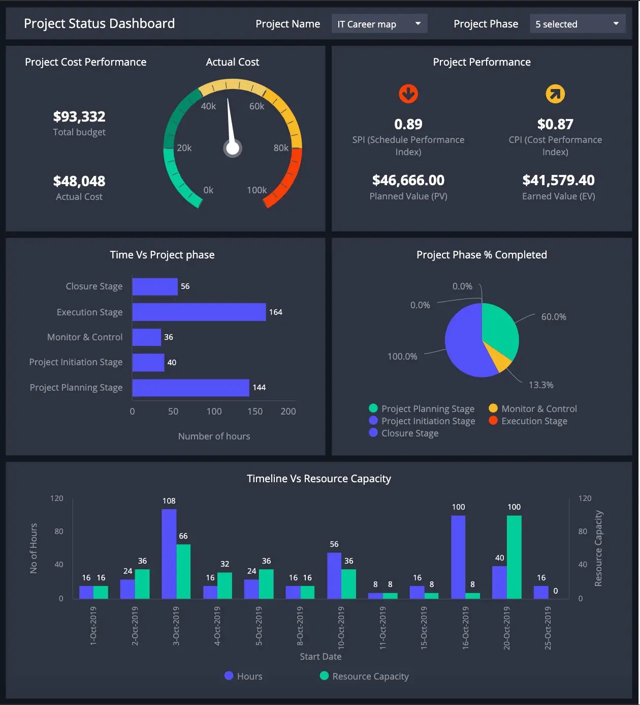
Data visualization indicators offer insight into the quickly and intuitively. They help people quickly compare actual performance metrics against pre-defined goals and compare demand and capacity over the timeline of a project. Gauge indicators provide clear and concise visualization of a metric’s progress to an endpoint.
Collaborate Better with Online Dashboards
Accessible by anyone you choose, anytime
Cloud-based tools have proven themselves to be easier to use in both our personal and professional lives. Dashboards are no exception to this rule.
When your dashboards are available online, important data and insights no longer need to be pushed by the product manager to the team or stakeholders during meetings, calls or conference calls. You can distribute them to whom you want, when you want. Display them on your office television screen, check them on your browser, via a link or on your mobile, via an app, or even embed them into your own application.
Online dashboards make it possible for everyone to check in on the data whenever they need to. They can prepare action plans, questions, or remarks for the following meetings. With everyone empowered and informed, project teams are more efficient.
Real-time data reporting and faster decision-making
When a dashboard tool is automated, it saves everyone in project management precious time. Start by setting data refreshes at the frequency that works best for you. Don’t spend any more time extracting data, creating static charts for PowerPoint decks, or doing manual data management in Excel. Besides, Excel is error prone and can cost you big time!
By connecting your dashboard tool directly to your data sources, you can automate data refreshes. You’ll never have to care about exporting the data, the version of the data, conflicted files, or errors in formulas again.
Automation will also help to keep you instantly informed whenever a critical threshold has been reached. You can set customized alerts for project spending, deadlines, resource benchmarks, underuse or overuse, etc. Stay informed like never before.
Getting Started with Zenkit and ClicData
If you don’t have an account with Zenkit or ClicData, you can sign up for free trials for both applications today.
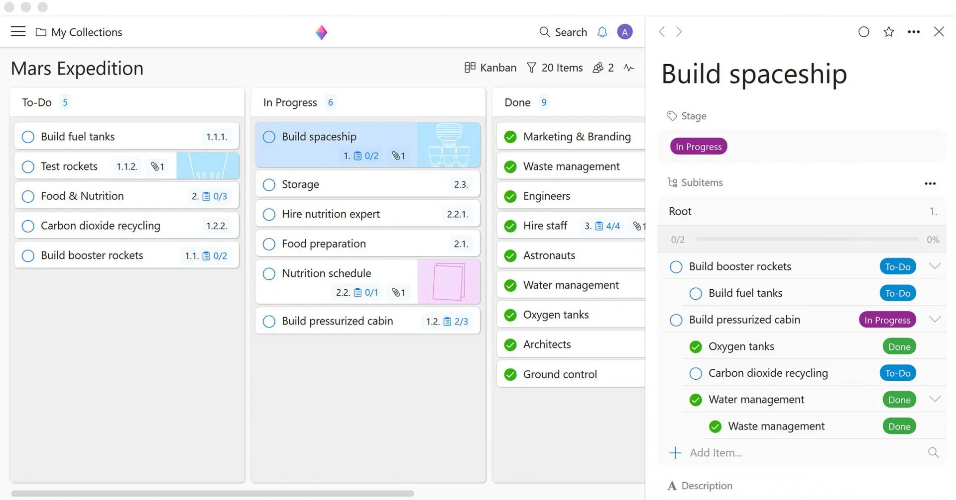
To get started with Zenkit, you can watch a short tutorial here.
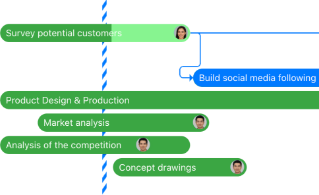
Create your collection and add tasks to your to-do list, as in the example below:
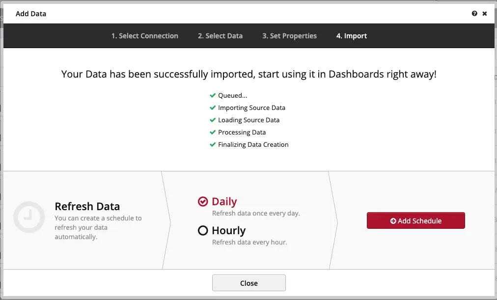
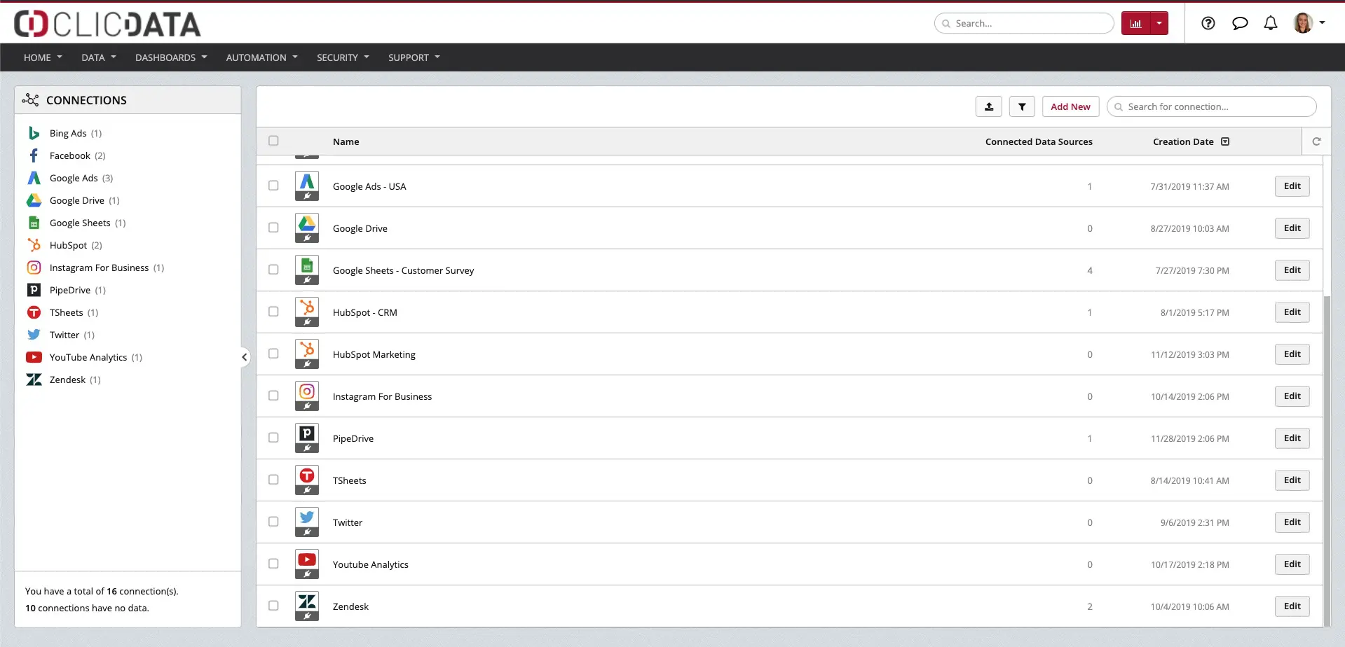
In ClicData, create a data connection with Zenkit using our WebService connector. You will be able to select which data from Zenkit that you want to import to build your dashboard.
Then, set up your data refreshes using the Schedule features.
Repeat these steps with any other data sources you want to incorporate into your dashboards.
Here’s a quick tutorial to get started on ClicData.
In conclusion, the data visualization capabilities of great business intelligence dashboards give you and your team the ability to leverage the insights your data offers you. ClicData lets you combine data from multiple data sources into a seamless data warehouse, so you get the big picture like never before. With your Zenkit data, you can deepen, enhance, and streamline your project tracking and market reporting all at the same time. You’ll wonder why you didn’t get started sooner!
Guest author: Axelle Seifert is a Marketing Manager at ClicData where her job is to make sure every team makes smarter and data-driven decisions with their fully automated Business Intelligence platform.


Leave a Reply