Spotlight on Backgrounds
A short feature interlude before the big reveal…

A Short Feature Interlude Before the Big Reveal…
First of all, let me say a big thank you to everyone who participated in last week’s campaign with Capterra! We got some really excellent feedback from so many of you and we’ll be responding to you all very soon.
At the moment we’re gearing up to release a few very exciting new features. I can’t tell you about them yet, but let’s just say next week is going to be a fun one 😉
While we’re preparing for the big reveal, I wanted to take a moment to highlight a little feature that could bring a bit more fun into your workday:
New Themes
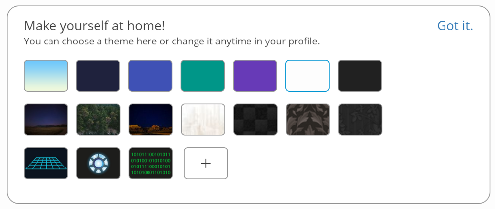
In case you hadn’t spotted it yet, there’s a way to change your profile background shown at the bottom of your homepage. The backgrounds you’re familiar with are still there, along with our new blue-green gradient.

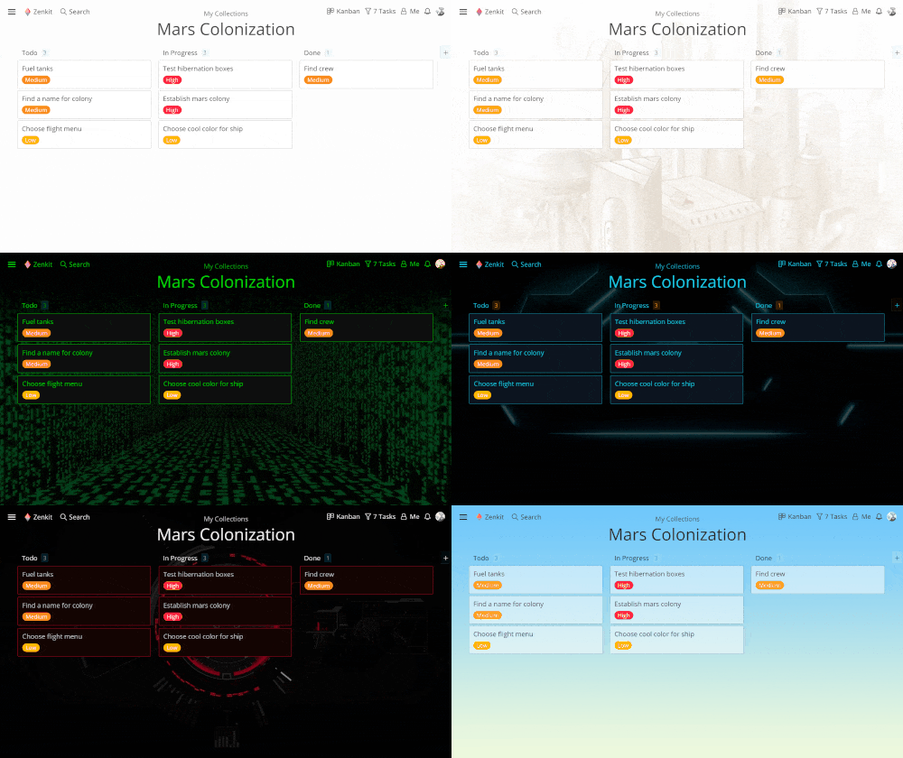
People asked us for some darker, more fun themes, so ‘Flynn’, ‘Tony’ & ‘Neo’ were born (the last three in the above image). These backgrounds and their neon borders were inspired by some of our favourite action movies. Can you guess which ones?

Changing Collection Backgrounds
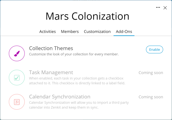
Another little change we’ve made is to how you change collection backgrounds. Where there used to be a tab called ‘Backgrounds’, there is now the ‘Add-Ons’ tab.

You set your background by enabling Collection Themes. If you disable it again, you’ll see the default background or the one you’ve set from your profile settings. You can learn more about customization options here.
Did you know that you can upload your own backgrounds to personalize Zenkit even further? All it takes is a boost up to Plus membership! Learn more about our membership plans here.
What do you think about the new themes? What other themes or images would you like to see? We’re always open to your feedback, so let us know in the comments below or by email at hello@zenkit.com!
Cheers,
Siobhan & The Zenkit Team
FREE 20 MIN. CONSULTATION WITH A PROJECT MANAGEMENT EXPERT
Wanna see how to simplify your workflow with Zenkit in less than a day?
Book a Live Demo