Ch-Ch-Ch-Ch-Chaanges!
Zenkit is getting a makeover

Over the past couple of months, we’ve been working on a big redesign of Zenkit, and we’re so excited to finally be able to share it with you! The new design will be rolling out over the next week, along with some great new features.
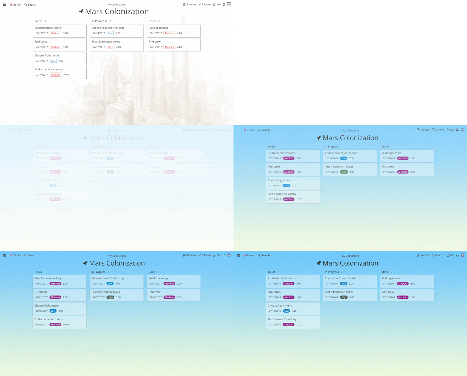
But first, why a redesign? Well, we love Zenkit for its flexibility, its future-facing, can-do attitude, for the sheer joy of working on it. But we felt that all these wonderful things weren’t reflected in the design. Although it was clean and simple, it didn’t feel fun or exciting. Some of you noticed this too. With your feedback, we’ve tried to find a beautiful balance between fun and function.
I had a chat with Jesse, our Lead Developer and main man behind the design, about the process and some of his favourite new features.
How Did You Go About Redesigning the App?
We are constantly working on the design in order to improve the user experience. Usually, we release small updates all the time, but once in a while, we lock ourselves in over the weekend and go through the whole app through the eyes of a new user.
By looking at it from a fresh perspective, we can get some distance from it and collect all the little details that we don’t notice because we’re looking at it all day, every day.
Next, we combine all those details to find a general rule that we want to apply. For example, this time around we noticed that the heavy shadows were overwhelming in some places and that the “hard” corners felt rather cold. So we came up with the general idea of giving the app a friendlier and lighter feel by reducing shadows and rounding up corners.
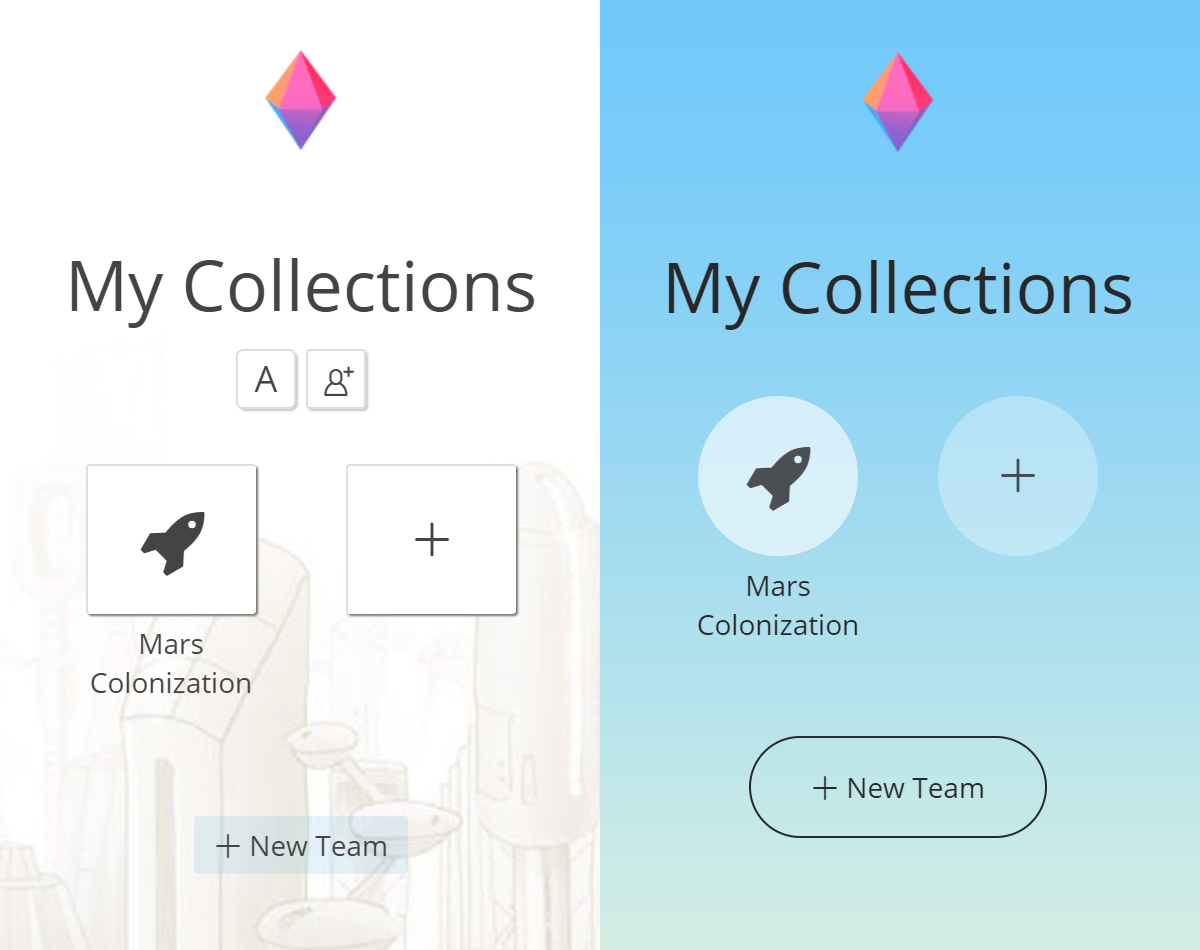
Sometimes when implementing little design changes, one thing leads to another and we find ourselves with a complete redesign. That’s exactly what happened here.
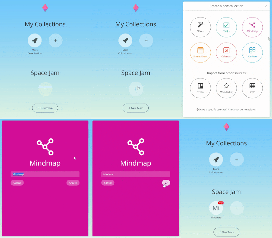
I Really Like the New ‘Create Collection’ Dialogue:
What Made You Decide to Do it This Way Instead of Just Staying with One Option?
We decided to use the six buttons to showcase what Zenkit is capable of, and to inspire users (old and new) to try a new perspective.
The animations, on the other hand, were kind of a coincidence. Martin (our CEO) and I were redesigning the new collection process when he had to pick up a phone call. I had some time on my hands so I started playing around with colours and animations. When he came back, I presented the results and we liked them so much that we decided to stick with them.
Is There a Change That You’re Particularly Proud of?
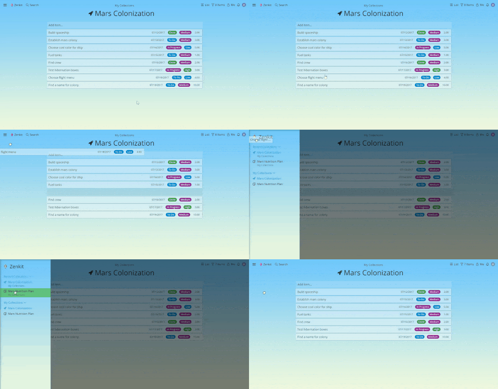
I’m quite proud of the way we implemented dragging items between collections to move them. We didn’t want to compromise our existing drag and drop features in any way, so I had to come up with a way of switching contexts in the middle of the dragging process (either dragging within the list and scrolling that list when reaching the end, or dragging within the side panel and scrolling). I think the result is pretty cool!
Thank you so much, Jesse! 👏👏👏
(He did actually show me a few other things, but I can’t share them with you yet!)
I Said There Were a Few More Features on the Way, So What Else Is New?
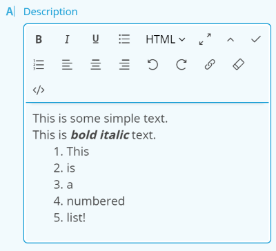
Rich text for multi-line text fields
You’ll be able to use HTML and markdown to make any text stand out, or even to save webpages!
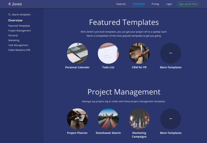
Templates for new collections or even new teams
This was another user favourite, so we’re happy to finally offer it to you. We hope that this will help new users learn about everything that can be done with Zenkit, as well as inspire current ones to try something new!
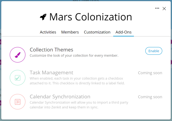
We’ve changed the way you can modify collections with a new ‘Add-Ons’ feature
This is where you’ll be able to change collection themes and add optional new features to your collection.
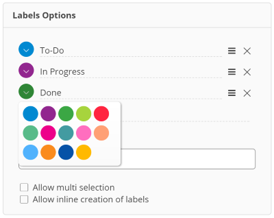
Bolder labels and more colour options for labels
This was requested pretty often by you guys, especially by Kanban fans. Let us know if you like them!
General speed improvements throughout the app
You’ll notice this, especially in the table and list view — once the page has loaded, scrolling is seamless! We’ve also made improvements to the responsiveness of the mind map view.
So there you have it. A new design, a bundle of new features, a lot of long weekends, and a lot more fun. We hope you love the new design as much as we do! We’ll be rolling it out to you in the next few days.
Cheers,
Siobhan, Jesse and the Zenkit Team
P.S. Keep your eyes on the blog in the next couple of weeks as I delve further into the details of our newest features.
P.P.S. We love your feedback! Let Jesse know what you think of the new design: comment here, or send an email to hello@zenkit.com.
FREE 20 MIN. CONSULTATION WITH A PROJECT MANAGEMENT EXPERT
Wanna see how to simplify your workflow with Zenkit in less than a day?
Book a Live Demo