New to Zenkit
Sort in Kanban, updated swimlanes, private fields, and more!
We’re gearing up to release some pretty big features in the near future, but that doesn’t mean we’ve stopped working on the little things! Here’s what we’ve added to Zenkit, along with a ton of tiny tweaks and fixes, in the last couple of months.

Sort in Kanban View
Sort your lists in Kanban view by any field of your choice! Kanban lists are used to be sorted simply by whether you added an item to the top or the bottom of the list, or by the order that you dragged them in. Now, with Kanban list sorting, you can choose to sort your cards alphabetically, by item age, according to the due date, labels, references, and much more.
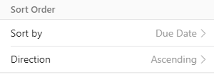
How to sort in Zenkit’s Kanban view:
- Click on the name of your view in the top right-hand corner.
- Click ‘Edit’ next to your view name.
- Click ‘Sort by’ and pick a field.
- Pick ascending or descending.
It’s as easy as that! Like all other Kanban view properties, the sort is specific to that particular view. If you create multiple custom Kanban views, each one can have a different sort applied and it won’t affect how other views are displayed.
Private Fields for Published Collections
If you’ve published a collection, you can now choose to hide certain fields from appearing to visitors. This option makes it much easier to control what information is shared with the public, and allows you to track all data, even confidential data, in one collection.
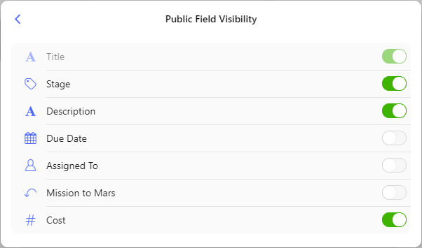
How to hide a field in a published collection:
- Click on the name of the field
- Scroll down and click the ‘Publicly visible’ toggle to the off position.
- Alternatively, change the field visibility in the published collection settings!
The option to hide certain fields was highly requested after the release of published collections and is already being put to use by teams like Mozilla, who have been using published collections to manage the proposed sessions in each of their Spaces at the upcoming MozFest. See how they’re making use of published collections & hidden fields by clicking ‘See the proposed sessions’ on any of the Spaces.
As always, more information about public and private fields can be found in our Knowledge Base.
Update to Mobile Menus
When we released our big design update a few months ago, we released swipe gestures for mobile, too. Swipe gestures are used to access workspace and collection settings, add new collections to workspaces, manage collection members, and much more. For Apple users, this is an intuitive way to find these menus, since swipe gestures are built into the iOS environment everywhere. However, Android users are not as used to using them, since only a few apps implement this kind of interaction. This meant that some Android users were having difficulty making simple changes such as adding collections and workspaces on the go. So, we added a button…
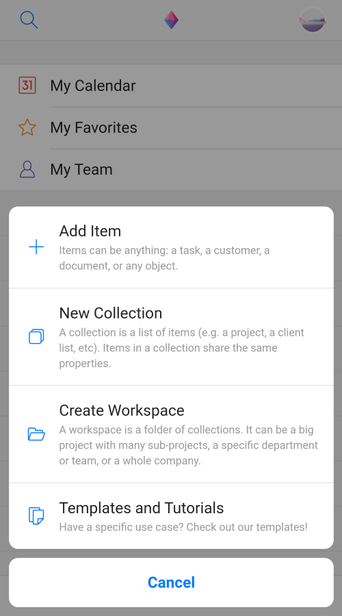
You can now add new items, collections, or workspaces from the + button found at the bottom right-hand corner of the app’s home screen. Workspace and collection settings are still accessed by swiping left on the workspace or collection name, but it is now much easier to add new ones in an intuitive way! You can also access Zenkit templates from that same + button, so you can install pre-made collections straight to your device.
New Kanban Swimlane Design
Last but not least, we changed the way the swimlanes in Kanban view were displayed. In the past, the list titles disappeared after you scrolled down the page. This could lead to confusion, as it wasn’t always clear which list an item belonged to. Now, list names stick to the top of each section as you scroll so that it’s always clear exactly what list or label applies to each item in the section.
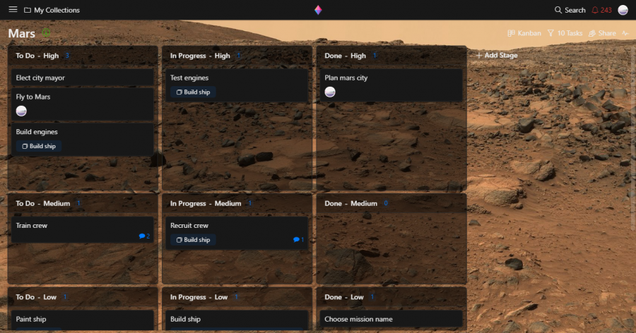
What do you think of these updates? Do you like them as much as we do? Let us know in the comments! Want to stay in the loop? Check out our changelog, which we’ll be updating with details of each new release (and will fill with details of past releases soon).
Cheers,
Siobhan and The Zenkit Team
FREE 20 MIN. CONSULTATION WITH A PROJECT MANAGEMENT EXPERT
Wanna see how to simplify your workflow with Zenkit in less than a day?
Book a Live Demo
it would be great to have the “sort by due date” and other sort options to the List view or to all the other applicable views. Thank you.
Hey Herris,
Thanks so much for the suggestion! We’ve got sorting in other views on our to-do list. I’ll add your vote to the existing feature request!
hi!
+1 for this point. Current swimlanes view is difficult to read for two reasons:
1) the one mentioned in this comment (shadows)
2) The one in the previous comment (headings of vertical swimlanes are duplicated). Why not try to align the headings vertically?
Both of this will improve the Kanban view dramatically!
Cheers
Thanks for your feedback! I’ve created a feature request on your behalf 🙂
When will Zenkit get rid of that awful swimlane shadow box? It was perfect before the update. Now the full screen is taken up by the swimlane shadows. Please for the love of god, put it back to how it was before – the first, top center picture on the Zenkit homepage even shows the old look.
https://zenkit.com/wp-content/uploads/2019/05/devices_screen3.png
Hi Richard, Sorry about that! We don’t know when we’ll next update the Kanban swimlanes, but I understand what you mean and have forwarded your feedback to our dev team.
It’s nice to see the app being updated frequently. I like the sorting option. Might I suggest adding this to List view as well?
Thanks Erik! I’m glad you like the latest updates! Yes, I’ll add your upvote to the existing feature request for it 😉
Is there any way to sort only one list in kaban view? This would be very usefull.
Hi Christian,
At the moment you can only sort the entire board, not just one list. May I ask how you would use this function? The more examples I can share with our dev team, the better they can understand your needs 🙂
I ‘m using your platform for a couple years now and I find it very useful. One of the features that keep me using it was the Kanban swimlanes (not found in Trello), but I’m afraid I don’t like your new change in it.
I get the point of it, the miss of the headline, but with your approach now everything seams really more cluttered, less tidy and messier than before. Too many cards in grids, it’s hard to keep the global vision this way.
I really prefer just setting the column header fixed on scroll, and not merge it with the lane title on every cross.
Just that, congrats for the rest of the changes =)
Thank you so much for your feedback, Rob. Our dev team weren’t able to build it with fixed headers this time round due to some rather complex technical reasons (basically if we want to build fixed headers, we would have to write the Kanban view again from scratch), however I understand where you’re coming from, and I’ll convey your suggestion to the team. 👍
I agree with Rob! I really don’t think this is the way to go with the swimlanes. To me they are one of the most important features so please look into it. In the meantime maybe a toggle button that allows the user to choose how they would like the swimlanes to be appear (new vs old) could be an option?
Great product! Thanks for it. Keep it up!
Thanks a lot for introducing the sorting feature.
It took me so much time to to this manually before. This really helps a lot!
So glad you like it, Lukas! Thanks!