Introducing a Brand New Zenkit Design
Enjoy a more intuitive, more beautiful, more modern Zenkit

We’ve been pretty quiet on here recently, and for good reason – our dev team have been hard at work redesigning the entire app from the ground up! Zenkit’s new design is cleaner, more modern, easier to understand, and way more mobile-friendly.
We loved our old design, but it lacked a coherent structure, having been built upon bit by bit over the years. Each new menu was written separately, every new feature was designed on its own, and the app wasn’t that fun to use on mobile devices. We decided to unify the whole design language of the app while improving mobile usability:
“We needed a flexible solution for dialogues, that would work on desktop, tablet, and mobile. The framework we came up with allows us to display dialogues in multiple modes (dropdown, modal, inline) and the mode can vary between devices. Even better, dialogues can be stacked on top of each other or reused separately in different contexts.
There simply wasn’t a framework or library out there that was capable of doing this on the web, so we built one ourselves.”
Jesse, CTO

So what’s new? Well, everything, and yet, not all that much! This is still the Zenkit you know and love, and most things are still where they used to be, just slicker and with way cooler animations. The first thing you’ll notice is the way items, menus, confirmation dialogues, and all manner of text entry points all adhere to the same design rules now. But we can be a bit more specific than that…
Mobile Updates
An all-round better UI & UX
Since the user interface and user experience on mobile devices (particularly iPads and other tablet devices) were what initially encouraged us to give Zenkit a design update in the first place, it’s only fitting that we start by highlighting the new features we’ve added to the mobile apps.
The team worked hard to ensure that the mobile apps looked and behaved as you would expect from a native app. Buttons are bigger, the text is better-spaced, the navigation animations are much clearer, and menus are easier to find. Binary actions such as subscribing to or downloading a collection, toggling default settings in a field, or managing notification settings are now controlled using simple toggles. Common mobile behaviours such as swiping to perform certain activities are enabled, and it’s now easier to share from other apps directly into Zenkit. The apps will be available in the next couple of days. So let’s get down to the details:
Swipe gestures on mobile
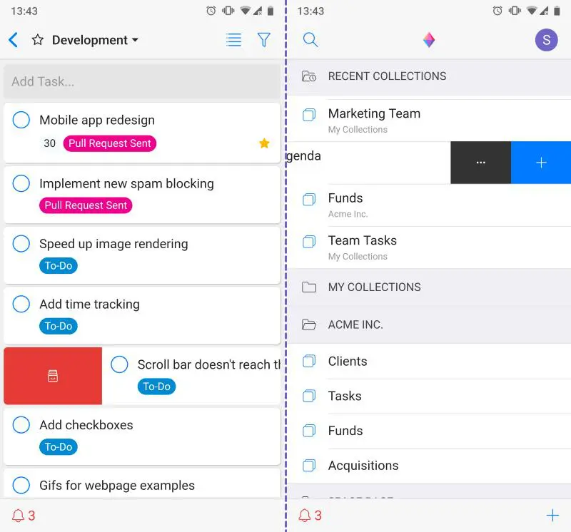
iOS users rejoice! The swipe gestures you know and love are now a part of Zenkit, too! (And, of course, they’re also available for Android users ;)) There are a few places where swiping comes into play:
- Home screen:
- On a collection: Swipe right to archive, left to add an item or open settings
- On workspaces: Swipe left to open settings or add a collection
- On global views: Swipe left to open settings
- In an open item:
- Files: Right to delete, left to download/open a link
- Members: Right to remove
- Checklists: Right to remove
- Collection / Workspace Members: Right to remove
- In the notifications menu: Right to mark as read/unread
- In list view: Right to archive an item
Share files to Zenkit from any other app
You can now easily share links, images, documents, and more to a new item in Zenkit via your phone’s ‘Share’ function! When you share a file, you can pick the collection you want to add to, give the item a title, and assign a due date.
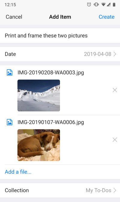
Once added, the new item will open and you’ll be able to add any further details. This sharing feature will, of course, be expanded in the future, with options to add to existing items and to enter data for other fields immediately in the share panel.
Shortcuts/Quick Add
For phones that support it, you can now add items and search your Zenkit collections by long hold on a Zenkit item!

Open the camera from the ‘Add files’ button
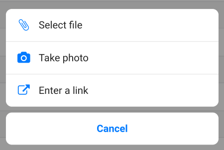
You can now add a photo directly from your camera by selecting the ‘Take photo’ option from the menu that appears when you click ‘Add a file…’ on any item.
All-Round App Updates
Of course, we didn’t just update the mobile apps! The design update applies to all versions of the app—web and desktop apps included. Many of the changes are just tweaks to the existing UI, however, there are several areas where we’ve made some big changes or added new functionality, which I’d like to highlight here.
New Profile, Collection, and Workspace settings
One of the biggest visual changes is the way our settings dialogues appear, and this is especially visible in your profile, as well as workspace and collection settings dialogues.
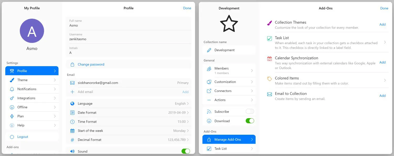
These new settings dialogues open with a single click (instead of the sometimes multiple clicks needed to open them in the past). Now, all actions are kept in the sidebar to the left, while settings are manipulated in the main panel on the right. If you enable an add-on, you will see it listed at the bottom of the actions panel so you can change your add-on settings directly there.
We feel that this new layout makes it much quicker and easier to find exactly what you’re looking for, and reduces the number of clicks needed to get anywhere.
Public vs private views
A new collection-specific feature we’re fond of is the new public and private views. Now, whenever you create a saved view (with or without an attached filter), you can choose whether that view is available to all users of the collection, or just shown to you. Private views will appear at the top of your view list, followed by public ones.
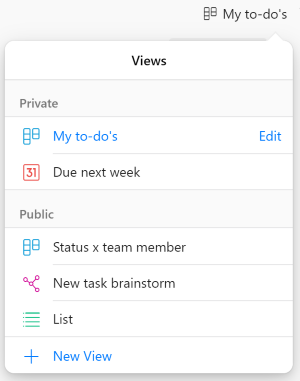
You can re-order them within their groups, and whenever you create a new view, it’s automatically marked as ‘private’ unless you toggle it back to ‘public’.
New saved filter settings
Not to be outdone by the views menu, we’ve made some changes to how filters look, too! In our new design, saved filters can be accessed by a ‘Saved’ tab within the menu:
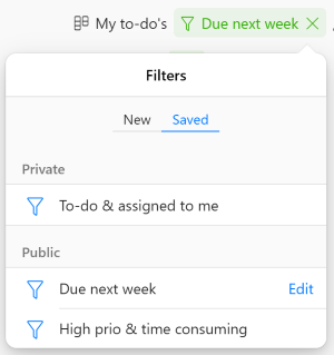
Filter settings have also received the ‘brand new menu’ upgrade, with lovely slide effects, clearer button hovers and a more logical layout.
More attached filter options
It used to be that when you wanted to add a saved filter to a view, you needed to first have that filter active. Now, you can pick any saved filter from your list to add to any view. It’s also now possible to add or change filters on a view from the mobile app 👌
New menus for field settings and activities
Field settings and activities have had a boost, too. You can still access them by clicking on the name of the field, but now it directly opens the field properties menu, with various field actions shown underneath the properties.
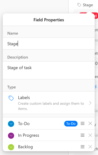
Quickly add or remove labels, edit field descriptions, toggle default settings on or off, or take advantage of field functions like duplicating, using bulk actions or setting a field as the Kanban grouping order all in one place.
Export button for mind maps
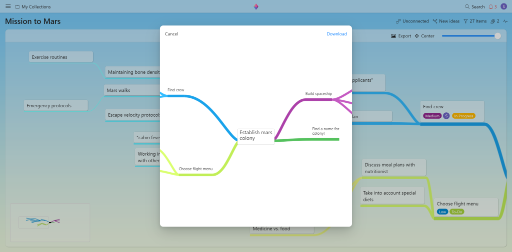
Finally! Export your mind maps in their entirety to .png format. The mind map export button can be found in the top right-hand corner of the map and will export your entire map in a streamlined, easy-to-read map.
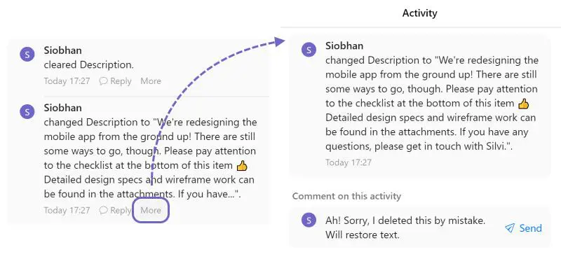
“More” button for activities
Accidentally deleted everything you wrote in a text field? Now you can retrieve that info by clicking ‘More’ under the activity to find your original text. This will open a panel that contains the entire text that was in the field before it was deleted. You can also comment on the activity from this panel (even if it’s just to let your colleagues know you’re putting everything back where you found it!).
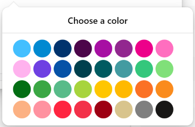
18 new label colours
Last, but not least! 🌈 Pick from a range of 32 colours for your labels to help differentiate your tasks & make your coloured items stand out!
That’s not all…
We’ve been busy creating a whole lot of exciting new features which we’ll be rolling out over the next few weeks (including a new way to connect Zenkit with other apps.. 😉). This update also has a whole host of bug fixes and little tweaks around the app that makes using it much more of a pleasure.
We hope you love the new design as much as we do! Please feel free to leave your thoughts and feedback in the comments below 🙏
Cheers,
Siobhan and the Zenkit Team
FREE 20 MIN. CONSULTATION WITH A PROJECT MANAGEMENT EXPERT
Wanna see how to simplify your workflow with Zenkit in less than a day?
Book a Live Demo
Sup, I love Zenkit, and I love the new views of Wikipedia and Hierarchy. Are you planning to do timeline wih dependencies view, like Omnigrag or Asana have? That would be awesome.
Hey Pavel! I’m so glad you love our new views! Keep your eye out on our blog tomorrow, we’ve got an announcement that you might like 😉
Hi, I’m big fan of Zenkit.
I have some wishes for View Feature to get even more amazing Zenkit.
1. How about custom visible field for Kanban/List view instead item size. Some information is simply more important than others and I want priority display them. And it would be better if user could arrange display field.
2. With Table view, I set a primary column and it doesn’t have any effect, how about primary column will be set as “Freeze Column” in Google Spreedsheat.
3. On mobile, Airtable’s table view makes users feel comfortable. but i think Zenkit absolutely can do it. Current table view is simply not good enough for me.
This is screenshot Airtable’s table view on mobile: https://ibb.co/Mcv6QCg
Hi Lucius!
Thank you so much for your feedback. I’m so glad to hear you’re such a fan!
1. Good idea 🙂 Our team have looked into some solutions for this, so I’ll add your vote to the existing feature request.
2. The primary column just tells Zenkit which text field should be used as the item title (i.e. the text at the top when you click to expand an item). Freezing columns is planned for the future, though. I’ll add your vote to it.
3. Thanks so much for this, and the screenshot. I’ve shared it with our dev team so they can take it into consideration when we next work on the table view 🙂
Hi @Siobhan O’Rorke,
From many relases of Zenkid I seen a problem with shortcut Alt+Z on MacOS. This shortcut is used by polish customers to write polish alphabet sign “ż”.
Can I remap or change a behavior of ALT+Z on Zenkit ?
Hi Pawel!
I’m so sorry about that. We’re aware of this issue but I’m not sure when we can build re-mapping of shortcuts in. In the meantime, I’d recommend that you use the web app because it doesn’t have that shortcut 🙂
I like the update but I have found a few real annoyances.
Filters: The default when selecting a filter should not be “new” but saved or apply. In addition on the android version of the app I should be able to just select the filter that I want and not have to select done each and every time I switch filters (or at least double the saved filter name to apply.
Editing Items: I really really wish there was a way that I could lock the field properties as to not be editable, I would prefer to be able to just enter the data. On my Android phone I have lost track of the number of time now that I have hit the field instead of the data and had to cancel then re-select the field data I want to change. This is becoming such an annoyance that I no longer use the mobile app to edit items, just to view and tick of items in my lists.
Hi Kevin,
I’m so glad you like the new update! 😊
Filters: I see what you mean about the ‘Done’ button on the mobile app. Regarding opening to ‘new’ – I can suggest that to the team but I don’t know if/when we can implement it. Have you tried adding a saved filter to a particular view? That way you can quickly switch between filters with views that match your needs exactly.
Editing items: I see your point and will suggest this to our team 🙂
This IOS user is nor pleased… Actions don’t open. Assigning persons shows no selectionlist, dragging task from one list to another is annoying, the whole board moves along.. and only with stubourn multi attemps are you able to move one column at a time.. No cheering here, sorry.
Hi Lieven,
Thanks for your feedback. I have shared it with our dev team but we’d love to learn more – could you please email service@zenkit.com with your device specs so we know what to test with?
As requested a few Specs
image1.PNG
Zenkit app version
image2.PNG
Bugs:
1. Actions on a task dont open.
Only a small white triangel ..
image3.JPG
Bug 2: No selectionlist in ‘assigned persons’
image4.JPG
Bug 3: move a task from one column to another on a Kanban board:
Everything moves, and you van only drag aan drop 1 column at a time.
image5.JPG
Strangely enough iT now is better than before. Of you want long enough, the back is not poging along
You guys did a fantastic job and it’s very nearly perfect. There are some performance issues which I think need to be addressed. Also, when editing themes or uploading custom backgrounds, you cannot see some of the Stage header text on your collection in Kanban view – having a slight fade under this, or transparency, will help reading text.
Thank you so much, Ranger! I’ll give your feedback to our dev team 👌
Hi Zenkit,
I love Zenkit and have been using it quite often.
Can you provide the Mindmap auto layout feature like Xmind which will be great? Now if I have many mindmap items, I have to manually move each item to avoid the overlap.
Another feature I suggest is to have the grouping indent in the Table view like Smarthseet. It would be very good for the project/tasks schedule perspective.
Hope to see these features soon. Thanks.
Thank you so much, Michael! I’m glad to hear you love using Zenkit 😊 I have forwarded your feature requests along to our dev team.
One of the best and my preferable tools out there. The seamless way it combines to-do lists, table for metrics, mindmap, kanban, calendar is just awesome. It’s so facilitating the consideration of using all that tools in a comprehensive way. In 3.0 looks like you have completely rewritten your front-end and it’s really fast now! Great update, great app, great support. Keep doing your thing! TY
Thank you so much, Vitaliy! I’m so glad you enjoy using Zenkit!! I’ll give your compliments to our dev team 🙌
Yay for the concept maps printout option!!! Much easier on the eyes and more professional looking for exec discussions.
So glad you like it, Karl! 🙏
Hi there,
the new design is most welcome and brings in some great improvements, many of which I found essential for a project management tool, great job on that part!
I was wondering about one thing which I just noticed:
When creating a link on tasks between collection, I can only select tasks to connect to from the primary hierarchy level, but I can´t select tasks which are a level deeper.
Example: Collection A, task hierarchy 1 can connect only to Collection B, hierarchy 1,2,3,4,5,6, etc., but not to the hierarchy level 1.1.,1.2. or 1.1.1 and deeper.
Am I doing something wrong or is this an expected behavior?
Also, is it possible to sort out tasks in the kanban view?
I’m afraid it’s not possible to sort in Kanban view at the moment, although several other users have requested this, so it’s definitely planned.
Hey Stefan,
Thanks so much! I’m glad you’re enjoying the new design 😊 I’m afraid I don’t fully understand what you’re referring to with regards to linking tasks.. are you using a reference field to link them? Any task of any hierarchy should be able to link to any other task, also regardless of hierarchy. If you’d like to discuss this further, please feel free to contact me on service@zenkit.com (with any screenshots, if that would help!).
Amazing. I love the new design.
Hi,
wenn wir ein Item öffnen, können wir leider nicht mehr in der weißen rechte Leiste scrollen. Wir können auch keine Kommentare abgeben etc. Dies ist relativ dringend, es hindert uns am Arbeiten.
Hallo Sabine,
Das tut mir echt Leid! So weit ich weiss war das ein Bug in Firefox das wir ende letzte Woche gefixt haben. Es sollte jetzt wieder möglich sein, innerhalb der Items zu scrollen.
Looking pretty –
any timeline for Gantt?
Thanks, Allen! Glad you like it 😊 No specific timeline yet. We’re working on subtasks & a heirarchical view next, which will lead up to Gantt, but I’m not 100% sure about timing I’m afraid.
Amazing work! Now I’m just waiting for android widgets, a good API and more integrations/automation points
All on the way!! API is almost done, we’ve got a pretty big integration coming in the next couple of weeks. Not sure when widgets are going to happen, but definitely this year some time. You can check out our roadmap here: https://zenkit.com/roadmap (it’s purposefully a bit vague)
Sounds awesome Siobhan, can’t wait!
Da hat sich echt was getan. Jetzt macht es noch mehr Spaß mit Zenkit auf mobilen Geräten zu arbeiten.
Vielen Dank
Vielen Dank, Klaus! Es freut uns, dass es dir gefällt! 🎉
Está mais organizado e bonito. Gosto de aplicativos que se reinventam e evoluem. Estou Using bastante o Zenkit. Adoro esse alien sereno e esquisito 😉
You are more organized and handsome. I like applications that reinvent themselves and evolve. I’m using Zenkit quite a bit. I love this serene and weird alien 😉
Obrigado! We’re so glad you like it, Ygor 👽🎉
Thank you!!! Zenkit is the best task management app I’ve found. Having the ability to drag and drop unscheduled tasks to the calendar is amazing, the mindmap functionality is what’s missing in the competition. I just found the apps and web UI to be unresponsive, I couldn’t rename collections after multiple attempts, and it’s frustrating to have Kanban be the default view when switching collections, especially when the Kanban doesn’t populate with tasks and shows as blank (even though it isn’t). I’d be happy to provide UI/UX feedback after trying the new version.
Thank you so much for your feedback! We’re so gald you enjoy using it, and I’m so sorry to hear you’ve had problems with a few things… I would love to hear more info about these issues. Please feel free to contact us via chat (you can enable it from your profile) or via email to service@zenkit.com
RE: Kanban as the default view – Zenkit usually remembers the view you last used and opens that. You can also create some custom views so that your exact settings will be opened when you enter the collection. I’m happy to elaborate via email/chat 🙏😊
Thank you so much for the private/public filter option! It was a real pain before when a lot of users shared their personal filters to all.
Thumbs up for the ongoing development, we really love using Zenkit and can’t wait for the upcoming new features for connecting other apps!
Thank you so much, Marcel! We’re so glad you and your team enjoy using Zenkit 🤸♀️ The private filter option was great for me too 🙌
Hi. I want to be in love with Zenkit, but I use a Wacom tablet as mouse, and Zenkit is not ready for it. Even if move my pen floating over the tablet, to meve the cursor without moving elements, Zenkit scrolls the content. I can’t use Zenkit until you fix that issue. Thanks.
Hey Guillermo! Thanks so much for your feedback. I completely understand why this issue prevents you from using Zenkit. We’ve added an improvement/feature request for the team so someone will look into it as soon as they can. 👌
Was waiting for this design update, looks great !!
So glad you like it, Rostane!! 🌈🙌
Hi Siobhan,
just got my first glance of Zenkit 3.0. Welldone, better and faster readable (esp. field backgrounds with smooth light grey, I love it!), looking entirely cool. Thanks ! Stefan
We’re so glad you like the new design, Stefan! 😍 The team worked really hard on it so I’m so glad to hear you’ve noticed so many improvements 🙌